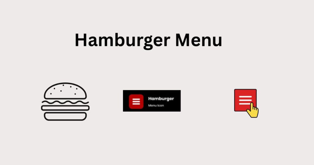
In the digital world, design and user experience are closely linked. Every element on a website must be designed to facilitate navigation while maintaining a pleasing visual appearance. Among the common but often underutilized elements is the ” hamburger menu . “
The “hamburger menu” refers to the icon consisting of three horizontal lines stacked on top of each other, resembling a simplified hamburger.
Typically placed at the top of web pages, it allows a drop-down or side menu to appear when clicked. Initially designed for mobile screens, it is now widely used on desktop versions of modern websites.
Table of Contents
1. Origins of the hamburger menu
The hamburger menu originated in the early 1980s, popularized by the Xerox Star software interface. Its use later intensified with the arrival of touchscreen interfaces on smartphones and tablets, responding to the need to simplify access to menus on small screens.
The hamburger menu icon, although now ubiquitous on digital interfaces, is not the result of a recent web design trend. It has its roots in the history of computing and human-machine interfaces. Its genesis dates back to the early days of graphical interfaces, long before the rise of smartphones or mobile apps.
1.1 Initial design at Xerox
The hamburger menu was designed in 1981 by Norm Cox , an interaction designer for Xerox , while developing the graphical interface for the Xerox Star , one of the first commercial computers to offer a visual user interface. The purpose of this simple pictogram (three horizontal lines of equal length) was to represent in a clean way a list of choices or a set of contents to explore .
Cox chose a minimalist form for two reasons:
- Simplicity of interpretation : the symbol had to visually evoke a list or a menu.
- Visual discretion : it should not dominate the interface or distract the user’s attention from the main content.
At that time, the hamburger menu icon was not yet clickable. It served only as a visual indicator to signal the presence of a navigation structure or hierarchy.
1.2 Temporary disappearance and return with the mobile
Despite its ingenuity, the icon remained marginal for several decades. It did not find its place in environments dominated by traditional “horizontal bar” or “vertical drop-down menu” types of Windows, Mac systems, or websites of the 2000s.
It wasn’t until the advent of smartphones and mobile apps in the early 2010s that the hamburger icon resurfaced. Faced with space constraints on small screens , interface designers sought compact solutions to hide menus without removing them. The hamburger menu, with its reduced form, naturally established itself as the ideal symbol for accessing secondary functions or more comprehensive navigation.
Among the first mobile applications to popularize this icon are:
- Facebook Mobile : since 2010, the hamburger menu has become a standard on iOS and Android.
- Airbnb, LinkedIn, Twitter (X) : these platforms quickly adopted this approach to lighten the main interface while providing access to secondary sections.
1.3 Gradual adoption in responsive design
The success of the hamburger menu on mobile influenced responsive design , which became the standard starting in 2012. Web designers began using the same icon on desktop, especially when the screen width became insufficient to display a full navigation bar. The hamburger menu then became a universal symbol for accessing navigation , regardless of the device.
1.4 A standard icon… but contested
Despite this widespread adoption, the hamburger menu icon has never been universally accepted:
- Lack of clarity for some users , especially those unfamiliar with digital interfaces.
- Accessibility problem , particularly on desktop, where user expectations remain oriented towards immediately visible navigation.
These criticisms have contributed to the emergence of more explicit alternatives, such as the fixed bar menu , the bottom menu on mobile, or even the chocolate menu .
1.5 Summary of historical milestones:
| Date | Key event |
|---|---|
| 1981 | Pictogram created by Norm Cox at Xerox |
| 1980-2000 | Marginal use in traditional interfaces |
| 2010 | Mass adoption with mobile apps |
| 2012+ | Generalization in responsive design |
| 2020+ | Debates around ergonomics and emergence of alternatives |
This return to the roots of the hamburger menu allows us to better understand its initial function and the reasons for its persistence in current UX design standards.
This historical perspective also highlights why it is now sometimes replaced by more explicit solutions, adapted to new user expectations.
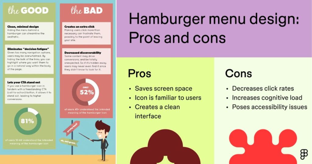
2. Advantages of the burger / hamburger menu
2.1 Space saving
On mobile or tablet devices, screen space is limited. The hamburger menu effectively addresses this issue by hiding navigation elements and revealing them only when necessary. This feature allows users to focus on the central content, thus improving the user experience.
2.2 Visual simplicity
Its minimalist design fits easily into sleek, modern interfaces, avoiding visually overloading web pages.
2.3 Cross-device consistency
By integrating a hamburger menu into a responsive website, the user experience remains consistent, regardless of the device used. This consistency makes it easier to remember and interact with.
3. Limitations and disadvantages of the hamburger menu
Despite its many advantages, the hamburger menu also has some limitations.
3.1 Poor menu visibility
Since the menu is hidden behind an icon, some users may not notice it immediately, which can decrease navigation efficiency.
3.2 Negative impact on discovery
The user does not directly see the menu items, which reduces the spontaneous discovery of the site’s sections. Some essential content may then be ignored.
3.3 Additional Interaction
Having to click to access the menu adds an extra step to the navigation process. This detail, even if small, can alter the user experience, especially on desktop.
4. Recommended Use Cases for the Hamburger Menu
The hamburger menu isn’t necessarily appropriate for every situation. Here are some specific contexts where it’s relevant:
- Mobile sites and web applications : ideal for freeing up screen space.
- Minimalist or aesthetic sites : when the emphasis is on design rather than immediate navigation options.
- Specific landing pages and promotions : to keep visitors’ attention focused on a single objective.
5. Evolution of the hamburger menu towards more ergonomic alternatives
The hamburger menu has long dominated mobile and desktop interfaces. However, its popularity is waning as solutions offering more fluid interactions emerge. These include the “chocolate” menu and other innovative approaches that facilitate navigation and speed up access to essential content.
5.1 Why is the hamburger menu giving way to new solutions?
The main criticism of the hamburger menu is its hidden nature, which slows down immediate access to features. Thus, to meet the growing need for speed and efficiency, more intuitive interfaces have emerged, allowing users to instantly access the main sections of a website or application.
5.2 The chocolate menu: an effective alternative
The “chocolate” menu, named after its shape, which consists of several small square or rectangular boxes similar to a chocolate bar, is a particularly relevant alternative. Unlike the hamburger menu, the chocolate menu clearly outlines all the main functions at first glance.
Benefits of the chocolate menu:
- Direct navigation: Essential sections are accessible without additional interaction.
- Increased readability: A clear and immediate view of the available features.
- Enhanced Engagement: Encourages spontaneous discovery of content through improved visibility.
This approach adapts effectively to contexts such as e-commerce sites, mobile applications, and complex interfaces requiring immediate accessibility to several key functionalities.
5.3 Other innovative solutions to replace the hamburger menu
Alongside the chocolate menu, other menu options are emerging to further optimize the user experience:
- Navigation Bottom Bar : Widely used in modern mobile apps, this bar at the bottom of the screen allows for easy use with the thumb, ideal for one-handed navigation.
- Floating Action Button (FAB) : Used in particular by Google Material Design, this floating button provides quick access to essential functions, particularly suited to applications.
- Gesture menus (navigation gestures) : Based on intuitive movements such as horizontal or vertical swiping, these menus are gaining popularity thanks to their ergonomics and fluidity, while completely freeing up visual space.
5.4 How to choose the right alternative to the hamburger menu?
The selection of a menu type should take into account the following criteria:
- Simplicity of the interface : Favor minimalist menus like the bottom bar or gesture navigation.
- Type of device used most often : Opt for the chocolate menu or a bottom bar on mobile, while on desktop, favor permanent navigation bars or contextual menus.
- Site or app goals : Visually focused sites will benefit from minimalist or gesture-based menus, while feature-rich interfaces will benefit from a bottom bar or chocolate menu.
While the hamburger menu remains relevant in certain contexts, the emergence of the chocolate menu and other alternatives demonstrates a constant need to improve navigation. These new models offer greater accessibility, more direct navigation, and a richer user experience. Their adoption reflects a necessary shift towards increasingly intuitive and efficient interfaces.
6. Recommendations for optimizing the hamburger menu
Here are some unusual, but effective, recommendations for improving the performance and usability of a hamburger menu:
6.1 Integrate a micro-animation
Adding subtle animations, such as a slight icon rotation or a smooth menu pop-up effect, enhances intuitiveness and grabs attention.
6.2 Complete the icon with an explicit label
To avoid ambiguity, add a short descriptive text like “Menu” to help users less familiar with this type of interface.
6.3 Previewing submenus on hover
On desktop, allowing a preview of subcategories to be displayed on hover optimizes interaction and reduces unnecessary clicks.
7. Tips for optimal SEO integration
Although the hamburger menu is not directly linked to AI SEO, its use can indirectly influence visitor behavior, and therefore SEO.
Here’s how to optimize integration:
- Make sure all links embedded in the hamburger menu are crawlable by Google’s indexing robots.
- Use clear markup and ARIA attributes for better accessibility and optimal indexing.
- Do not hide essential content behind this menu to avoid negatively affecting the user experience, an indirect criterion of SEO .
8. Key points to remember (quick checklist)
- Hamburger menu adapted to mobile interfaces.
- Limit use on desktop, except in special cases.
- Animate subtly to attract attention.
- Always accompanied by explicit text.
- Make content easily crawlable by Google.
- Regularly test its effectiveness using heatmaps and UX analyses.
The hamburger menu, despite its ubiquity and apparent simplicity, deserves careful consideration regarding its use. When properly implemented, it represents a significant lever for optimizing the user experience and overall design of a website. However, when used incorrectly, it can hamper navigation and reduce user engagement.

Pradeep Sharma is a author the mind behind Techjustify, where I craft insightful blogs on technology, digital tools, gaming, AI, and beyond. With years of experience in digital marketing and a passion for tech innovation, I aim to simplify complex topics for readers worldwide.
My mission is to empower individuals with practical knowledge and up-to-date insights, helping them make informed decisions in the ever-evolving digital landscape.